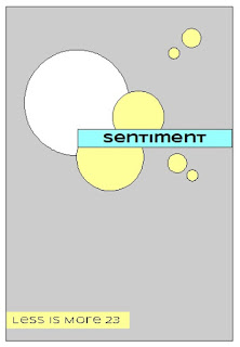
and here's the sketch:
I left my panel white on white because I wanted to keep it simple. I think I should have put a coloured edge around it. I coloured my hearts in the same set of colours as the ears and heart on the image. I did try to ombre the colours but the edge wouldn't soften but I quite like the pattern it made. I wasn't sure how far my sentiment would stretch and I should have started it a little further over but it was hard enough to stick down in the first place so that's where it's staying. The little flowers are the off cuts from a corner punch I have but they seemed to fit the bill. I hope you like my interpretation.
Thanks for reading.
Love Dawn x


A super card Dawn, such a cute Koala and great take on the sketch.
ReplyDeletePauline - Crafting with Cotnob
x
This little guy is so cute. Perfect for the challenge! Thanks for sharing at Less is More!
ReplyDeleteAmazing use of the sketch! The hearts you used really tie the message of your card together and go so well with the sketch. Great thinking with this one.... And great coloring too! Thanks for joining us at Less Is More!
ReplyDeleteSo cute. Love this little loving guy. Great colours and colouring and it really doesn't matter that the sentiment isn't over further, we can clearly see the sketch design shining through :)
ReplyDeleteThanks so much for sharing with us at Less is More, Anita x